

Understanding Subscription Manager Custom Elements
Subscription Manager has several custom elements that are key components we use throughout the Subscription Manager to encapsulate interaction-heavy functionality. This guide goes through several of those elements and how they are used in the template files.
Requirements
This article is intended for developers on v25 templates. You should already have a thorough understanding of the fundamentals of HTML, CSS, and Javascript.
How to tell what version you’re on
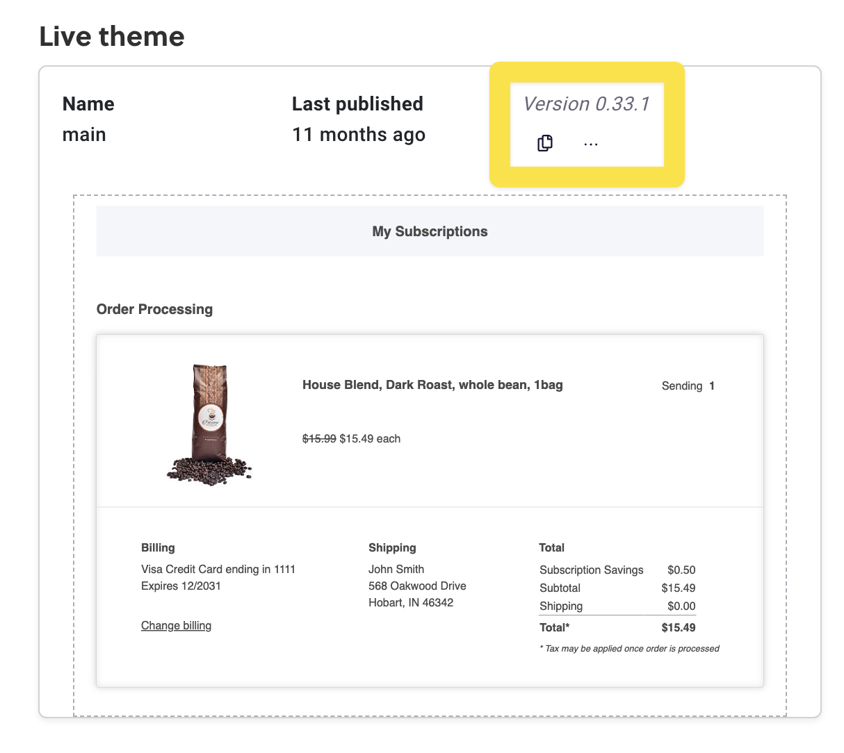
Before the September 2024 release of v25, all Subscription Manager installations were on version 0, displayed in the Theme Designer as version 0.X.X. You can check which version you’re on by going to Ordergroove > Subscription > Subscription Manager.
Custom Elements
Datepicker
The datepicker element facilitates a styled calendar pop-up that allows the user to select a date. You can find more information about customizing the datepicker in this guide.
The datepicker is triggered by a button, and the selected date is saved into a hidden input field for form submission. The footer includes "Cancel" and "Save" buttons to manage the datepicker's state. The example below demonstrates how to use the <sm-datepicker> element within a form.
<form action="{{ 'some_action' | action }}">
  <sm-datepicker data-submit-on-save="true">
    <button data-datepicker-trigger>Show datepicker</button>
 		{% include 'ui-elements/datepicker-popover' %}
    <div data-slot="footer">
      <button data-datepicker-cancel>Cancel</button>
      <button data-datepicker-save>Save</button>
    </div>
    <input type="hidden" data-datepicker-input name="some_form_field" value="{{ some_date }}" required>
  </sm-datepicker>
</form>
Dialog
The <sm-dialog> element does not add any additional HTML, but it does automatically add extra event listeners and handles closing the dialog.
The dialog header includes a close button, but you can also include a button yourself that calls SMDialog.close.
This is a sample dialog element crafted with the sm-dialog component
<sm-dialog id="og-test-dialog">
  <dialog>
    {% set dialog_header_text = 'Skip upcoming order' %}
    {% include 'dialog-header' %}
    <div class="og-dialog-body">
      <p>
        By skipping your upcoming order, the order will instead send on the next available date based on the frequency
        you selected.
      </p>
    </div>
    <div class="og-dialog-footer">
      <button @click="{{ 'SMDialog.close' | js }}">Cancel</button>
      <button>Send now</button>
    </div>
  </dialog>
</sm-dialog>
To trigger a dialog opening, use a button with data-click-target and an @click event as shown in this example:
<button data-click-target="og-sku-swap-dialog-{{ subscription.public_id }}" @click="{{ '(e) => SMDialog.open(e)' | js }}">Open dialog</button>
Toggle
This implements a "disclosure widget" to hide and reveal content. The button to reveal the content should have a data-toggle-trigger attribute and the content to be revealed should have a data-toggle-content attribute.
The element will handle adding the appropriate ARIA attributes to the trigger and animating the content in and out. When the content is revealed, the sm-toggle element will have a data-open attribute.
The following example demonstrates the correct use of the sm-toggle component.
<sm-toggle>
  <div>
		<button data-toggle-trigger aria-label="Order details"></button>
  </div>
  <div data-toggle-content>
		<p>Content to hide/reveal</p>
  </div>
</sm-toggle>
Updated 6 months ago