

Adding a Cancel Button to Modals
Learn how to add a dedicated 'Cancel' button to pop-up modals in the Subscription Manager to maintain website continuity and improve user experience.
Out of the box pop-up modals in the Subscription Manager contain a confirm action button and a standard 'X' close button that customers can use to close the modal. Sometimes, to keep website continuity, an additional 'Cancel' action button is needed. This article takes you through adding a dedicated 'Cancel' button to the modals.
Important: This article applies to themes using version 0.X of the Subscription Manager. If your theme uses a different version, some features or options described here may not be available or may differ in behavior. You can find your theme version on the Subscription Manager landing page or in the top right corner of the Theme Editor view. Please ensure you are referencing the correct version of your theme before making changes.
Applicable Files
The following files contain popup modals you can add a cancel button to:
- change-date.liquid
- change-shipment-address.liquid
- delete-item.liquid
- pause-subscription.liquid
- reactivate-subscription.liquid
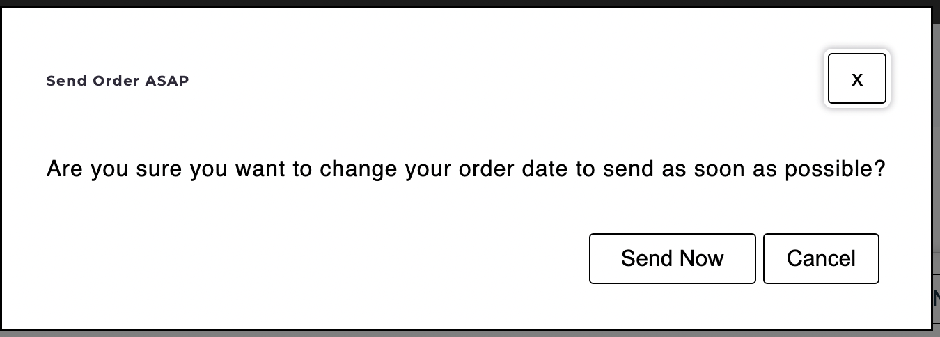
- send-now.liquid
- skip.liquid
Accessing the Advanced Editor
We'll be using the advanced editor to modify the Subscription Manager. You can access it through your Ordergroove Admin:
- Log in to Ordergroove.
- Go to Subscriptions on the top toolbar, and select Subscriptions Manager
- Toggle Advanced on the top left.
SupportSome aspects of this article require technical expertise with coding languages. This is self-serve and outside of the normal support policy.
Adding the Cancel Button
Open one of the files mentioned above. You can add a cancel button to the popup modal, look for the following <div>:
<div class="og-dialog-footer">Within this <div>, below or above the existing <button> element, add the following code:
<button class="og-cancel-button" type="reset" aria-label="{{'modal_close_cancel' | t }}">
{{ 'modal_close_cancel' | t }}
</button>
The end result should look similar to this:
<div class="og-dialog-footer">
  <button class="og-button" type="submit" name="change_shipment_date">
    {{ 'modal_change_date_save' | t }}
  </button>
  <button class="og-cancel-button" type="reset" aria-label="{{ 'modal_close_cancel' | t }}">
    {{ 'modal_close_cancel' | t }}
  </button>
</div>
In en-US.json file after:
"modal_close": "x",Add the following:
"modal_close_cancel": "Cancel",This will also need to be added to the other language files. In fr-CA.json add:
"modal_close_cancel": "Annuler",In es-ES.json add:
"modal_close_cancel": "Cancelar",In the buttons.less file, add the following:
.og-cancel-button {
  border: @button-border;
  border-radius: @button-border-radius;
  padding: @button-padding;
  cursor: pointer;
  background: @button-background;
  font-size: @button-font-size;
  font-family: @button-font-family;
  color: inherit;
  margin: 0px 5px;
}Note: Default styling is shown in the code example above.
Updated 7 months ago